您现在的位置是:网站首页> 编程资料编程资料
三步用CSS写一个商城卡券利用css3径向渐变做一张优惠券的示例CSS实现优惠券边沿打孔效果
 2023-10-19
327人已围观
2023-10-19
327人已围观
简介 这篇文章主要介绍了三步用CSS写一个商城卡券的相关资料,文中通过示例代码介绍的非常详细,对大家的学习或者工作具有一定的参考学习价值,需要的朋友们下面随着小编来一起学习学习吧
今天是618 ,各大商城都在搞促销活动,今天我们就来用css做一个商城卡卷,具体如下:
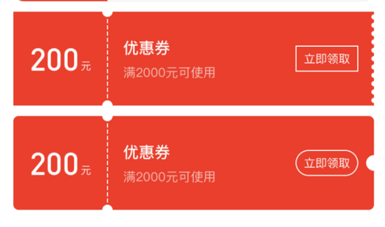

还在为上面这样格式各样的商城卡券的样式而发愁?CSS 不熟,canvas 太难,怎么办?
用 CSS 写一个商城卡券需要几步?
一共需要三步:
- 打开这个网址(浏览器输入 https://qishaoxuan.github.io/css_tricks/hollowOut/ )
- 找到需要的样式
- 复制粘贴
交给测试后,我们来分析下 CSS 卡券。
我们来准备一下基础知识
radial-gradien:
background: radial-gradient(shape size at position, start-color, ..., last-color);
| 值 | 描述 |
|---|---|
| shape | 确定圆的类型: ellipse (默认): 指定椭圆形的径向渐变。 circle :指定圆形的径向渐变 |
| size | 定义渐变的大小 |
| position | 定义渐变的位置 |
这样,我们能很容易写出一个居中的圆形背景图
.center-circle { width: 100px; height: 100px; background: radial-gradient(circle at 50px 50px, transparent 10px, #00adb5 0); }linear-gradient
background: linear-gradient(direction, color-stop1, color-stop2, ...);
| 值 | 描述 |
|---|---|
| direction | 用角度值指定渐变的方向(或角度) |
| color-stop1, color-stop2,... | 用于指定渐变的起止颜色 |
我们不需要知道具体的渐变过程,只要写一个简单的,写一个使用渐变属性而不渐变背景图即可:
.linear-gradient { width: 100px; height: 100px; background: linear-gradient(to right, #00adb5, #00adb5); }background
background 是可以设置多个图片的,遵循 background: [background-color] [background-image] [background-repeat] [background-attachment] [background-position] / [ background-size] [background-origin] [background-clip]; 使用 , 隔开即可。
开始组合基础知识
写一个最简单的

只要把上述中心圆示例的圆形位置定位在左侧即可
.left-circle{ width: 100px; height: 100px; position: relative; background: radial-gradient(circle at 0 50px, transparent 10px, #00adb5 0) top left/100px 100% no-repeat; }进一步学习

你可还记得 background 是有 repeat 属性吗?也就是说我们只要设置一部分样式,再使用 repeat 即可,看下图片,这不就是一个不渐变的 linear-gradient 和 radial-gradient 的组合吗,再借助伪类,我们即可写出来了。
.hollow-circles { width: 300px; height: 100px; position: relative; background: #00adb5; margin-bottom: 10px; } .hollow-circles::after { content: ''; position: absolute; height: 5px; width:100%; left: 0; bottom: -5px; background-image: linear-gradient(to right, #00adb5 5px, transparent 5px, transparent), radial-gradient(10px circle at 10px 5px, transparent 5px, #00adb5 5px); background-size: 15px 5px; }复杂一点

看见很简单,不就是刚才那个圆再画一个吗,但是要考虑到两侧的颜色是不同的,所以我们需要画四个背景图才行,将每个圆定位在方形的各个角落,然后组合在一起即可。
.two-circles { width: 300px; height: 100px; background: radial-gradient(circle at right top, transparent 10px, #00adb5 0) top left / 60px 51% no-repeat, radial-gradient(circle at right bottom, transparent 10px, #00adb5 0) bottom left /60px 51% no-repeat, radial-gradient(circle at left top, transparent 10px, #eeeeee 0) top right /240px 51% no-repeat, radial-gradient(circle at left bottom, transparent 10px, #eeeeee 0) bottom right /240px 51% no-repeat; }以上就是本文的全部内容,希望对大家的学习有所帮助,也希望大家多多支持。
相关内容
- css3实现蒙版弹幕功能前端实现弹幕效果的方法总结(包含css3和canvas的实现方式)CSS3 实现弹幕的示例代码
- 使用CSS实现黑暗模式和高亮模式的切换功能CSS中引用svg图片支持动态切换颜色的实现代码基于Css Variable的主题切换完美解决方案(推荐)详解如何简单实现CSS主题的切换纯css实现选中切换效果的示例纯CSS免费让网站拥有暗黑模式切换功能的实现代码
- CSS使用placeholder-shown伪类实现输入框浮动文字效果css浮动 float属性详解CSS实现元素浮动和清除浮动的方法纯CSS3+SVG实现的机器人悬浮动画效果源码html/css中float浮动的用法实例详解Css实现清除浮动的方法汇总什么是BFC? CSS 使用伪元素清除浮动的方法CSS3 清除浮动的方法示例CSS 清除浮动与BFC的方法
- css 权重值(层叠性)实例详解 CSS中选择器的权重值的计算浅谈CSS中的继承性,特殊性,层叠性和重要性
- 如何反转CSS中的贝塞尔曲线的实现方法CSS 曲线阴影实现的示例代码CSS3实现曲线阴影和翘边阴影
- CSS3中媒体查询结合rem布局适配手机屏幕纯js和CSS3媒体查询制作简单的响应式导航菜单特效源码详解CSS3 Media Queries中媒体属性的使用 CSS3媒体查询Media Queries基础学习教程使用CSS媒体查询(Media Queries)和JavaScript判断浏览器设备类型的方法CSS3媒体查询(Media Queries)介绍css3 响应式媒体查询的示例代码
- CSS Sticky Footer 几种实现方式
- css等高布局常用几种方式css多种方式实现等高布局的示例代码css设置多列等高布局的方法示例前端应该掌握的CSS实现多列等高布局技巧利用CSS3的flexbox实现水平垂直居中与三列等高布局浅析CSS等高布局的6种方式用CSS实现三列DIV等高布局以传达更好的视觉效果CSS 三栏等高布局实现方法CSS实例:三列等高布局-CSS教程-网页制作-网页教学网
- 全民飞机大战叉叉助手破百万不异常教程_刷金币刷分心得_手机游戏_游戏攻略_
- 全民飞机大战战机满级弹道所有战机满级弹道表一览_手机游戏_游戏攻略_